ShopDreamUp AI ArtDreamUp
Deviation Actions


Suggested Deviants


Suggested Collections


You Might Like…


Featured in Groups

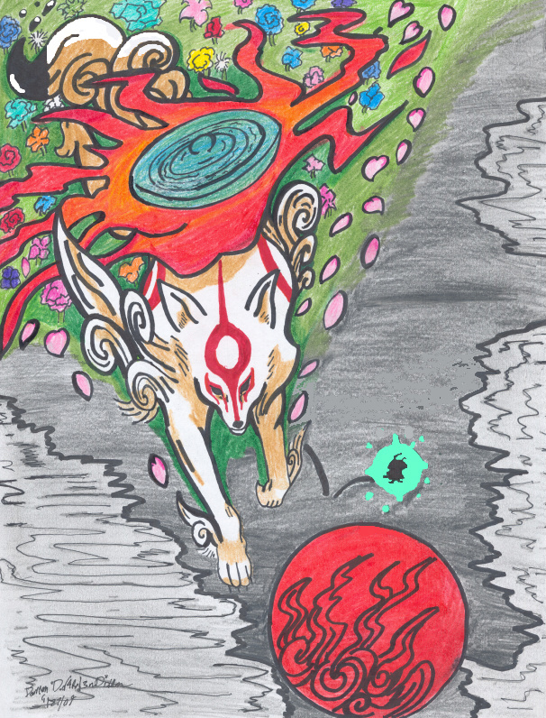
Description
Okami is one of the best games out there (for either PS2 or WII) and I love playing it lol XD
This is done with pencilcolors (except issun, whom I had to color via photobucket's crappy coloring thingy,) but Over the summer I want to edit it some with photobucket (make it more "watercolorie")...or what do you think?
fine the way it is?
This is done with pencilcolors (except issun, whom I had to color via photobucket's crappy coloring thingy,) but Over the summer I want to edit it some with photobucket (make it more "watercolorie")...or what do you think?
fine the way it is?
Image size
606x796px 390.64 KB
© 2009 - 2024 dd4rri3nd
Comments139
Join the community to add your comment. Already a deviant? Log In
Whoaaa! This totally stood out to me when I was looking for stuff to critique on your page. So I'll try to keep it short without being to vague! That might be hard, because I write a lot, haha...
Okay! Here we go.
Vision:
Reaaaaaally nice! This looks really great! Love the concept, the wolf looks so... majestic, royal. The color scheme works perfectly to carry out the feel of this picture. Overall, nice! But let me point out the things that bother me a bit.
First off, some of the details in the abstract background look haphazardly done. For instance, the area behind the wolf seems a bit weird--the petals aren't 'flowing' properly, and the flowers in the green look a bit strange. Also, some of the coloring seems unfinished, because there are white spots and a lot of flat colors. Maybe you need more shading? But I think the flat colors would have seemed more 'strong' and provided a better overall feel if there weren't any white spots and if it were all boldly colored.
I really love that wolf though, and the only mistakes I can see are in the background.
So really good job!
I'll give you a 3.5 / 5 for vision.
Originality:
Verrrry original! These abstract backgrounds are really hard to make so that the foreground blends in. So the design wasn't all that repetitive and the whole concept of the piece in general is creative, fresh, and original! I really like it.
So for originality, I'll give you a 5 / 5!
Technique:
Great technique! It seems like a lot of effort was put into the piece and you used a really nice color scheme to bring out the overall effect of the picture. The colors themselves were also nicely done, except for as I mentioned before, the few white spots, which could be easily corrected. If the colors were stronger, the piece would seem really majestic and mystical, so just color everything in strongly!
I think you did a really, really good job with the inking.
So for technique, I'll give you a 3.5 / 5.
Impact:
W-o-n-d-e-r-f-u-l!!! So royal and mystical! The color scheme (as I mentioned several times before, lol) is what really brings out this feel, and the background really fits the animal you chose. And the expression of the wolf is just OUTSTANDING. I stopped dead and stared at this piece a few minutes when looking at your profile, so for impact, the least I can say is: AMAZING!
So I'll give you a 4.5 / 5!
That's about it!
Great, great, GREAT job! I hope I didn't bore you TOO much with the lengthy descriptions, and hopefully I could convey how I felt about this piece well enough through my... fail... words. XD;; Niiiice! I'll look for more pieces to critique in your gallery. This is outstanding. <img src="e.deviantart.net/emoticons/h/h…" width="38" height="15" alt="